Masons - MOT & Service Centre
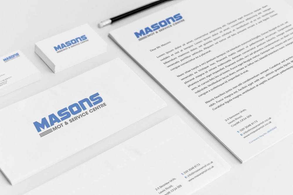
Branding Design for Masons MOT & Service Centre.
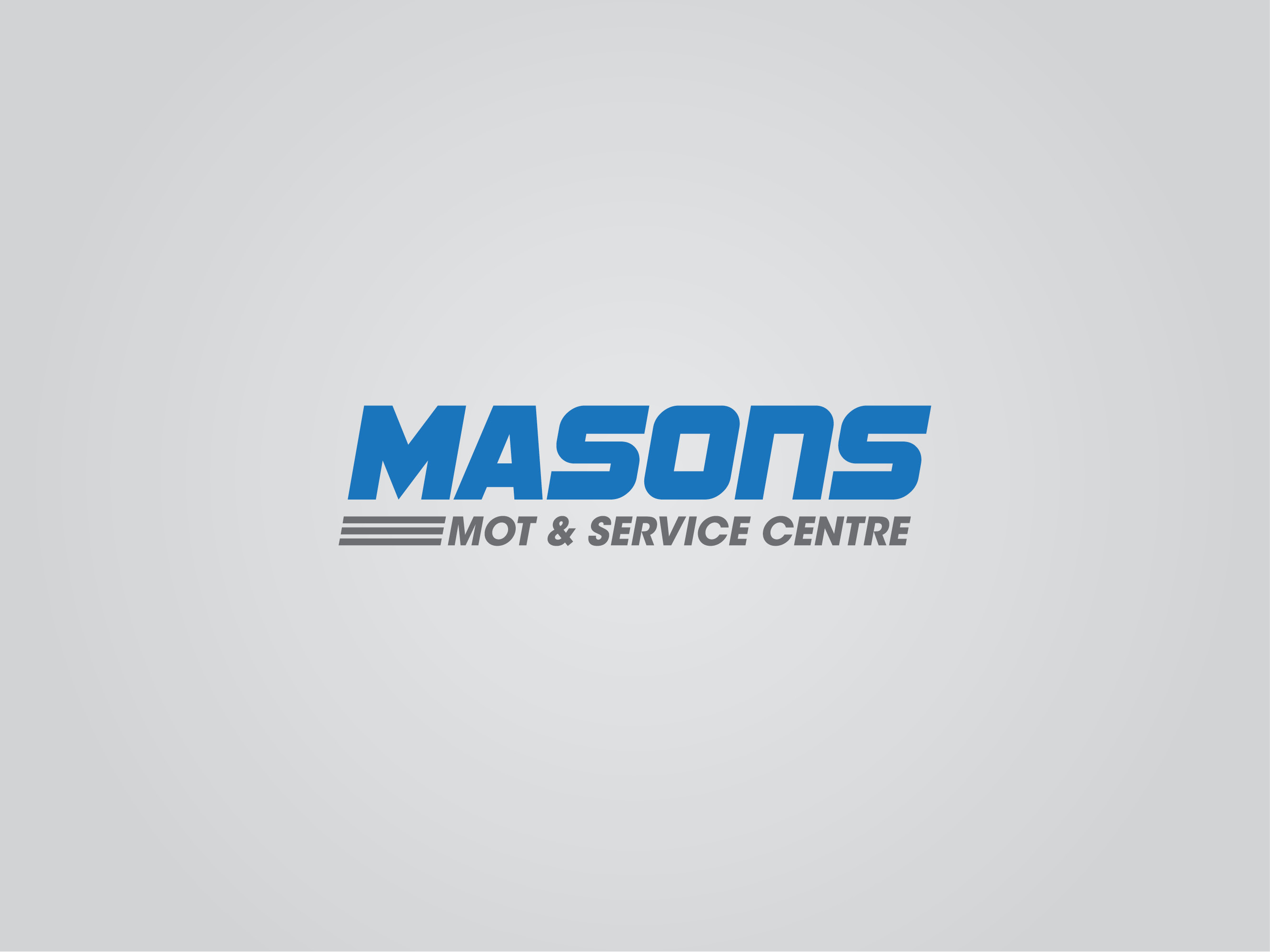
For this logo design I created a sense of speed, the choice of typeface is bold, manly and forward moving. The three strips below the 'M' further adds to the feeling of speed and movement, all relating to motors and vehicles.
The chosen colour palette is sporty and industrial ensuring that it resembles an accurate connection to a MOT & Service centre.
The logo is both versatile and professional making it suitable for stationary, merchandise and online presence.

