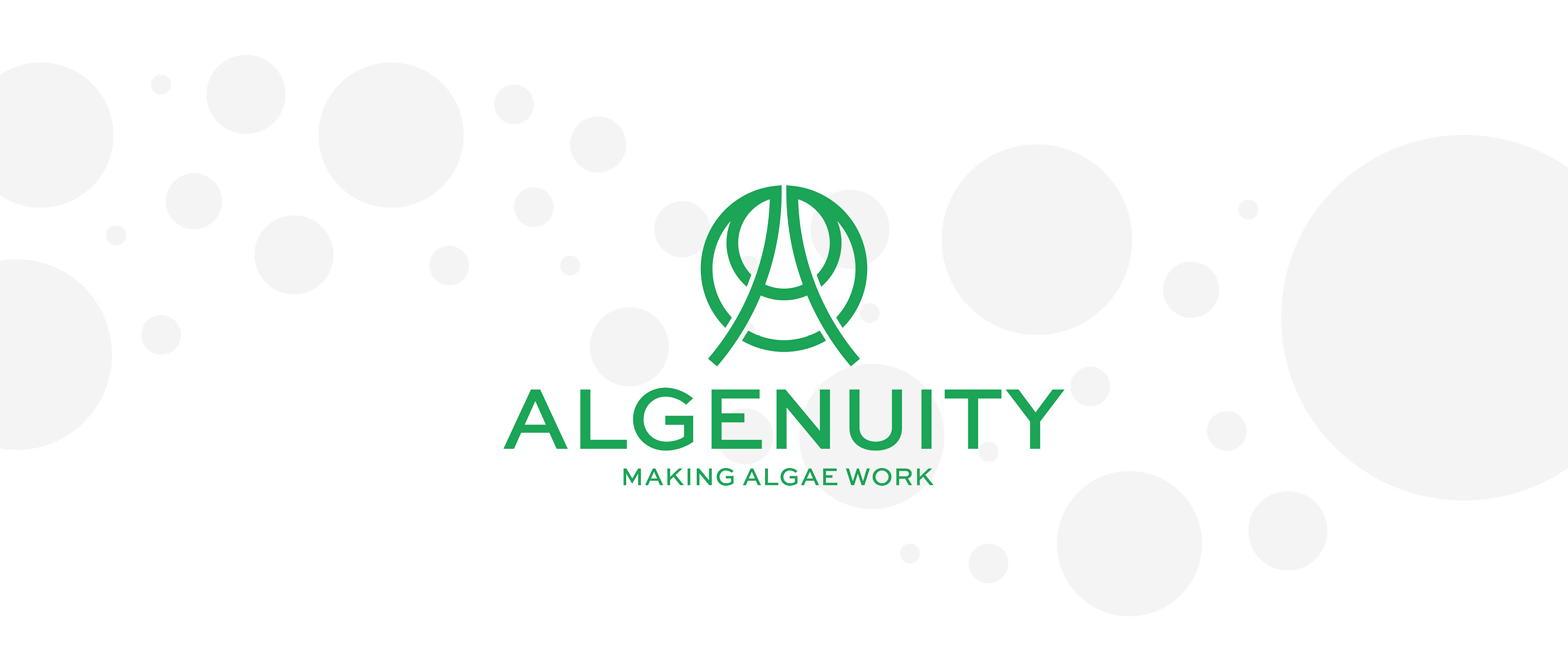
Algenuity is a cutting-edge biotech company specialising in algae based solutions. Their breakthrough technology and innovations are delivering exciting, fresh and sustainable plant-based ingredients for the evolving marketplace.
When the founder reached out to me the company had very little branding and were seeking guidance on all things design related to their brand as they prepared to spin off into a limited company. This included recommendations spanning from brand strategy and architecture, to core positioning and messaging, to a rebrand that would range from company to products.
Stepping into a whole new industry required multiple site visits to first hand experience the science at work. Numerous phone calls, questions, reading, listening and spending time with the team gave me the understanding I needed to develop a unique design system.
Algenuity needed a rebrand that would communicate their disruptive approach to the algal world and capture their mission: ‘making algae work for positive global impact’ whilst appealing to global corporations.
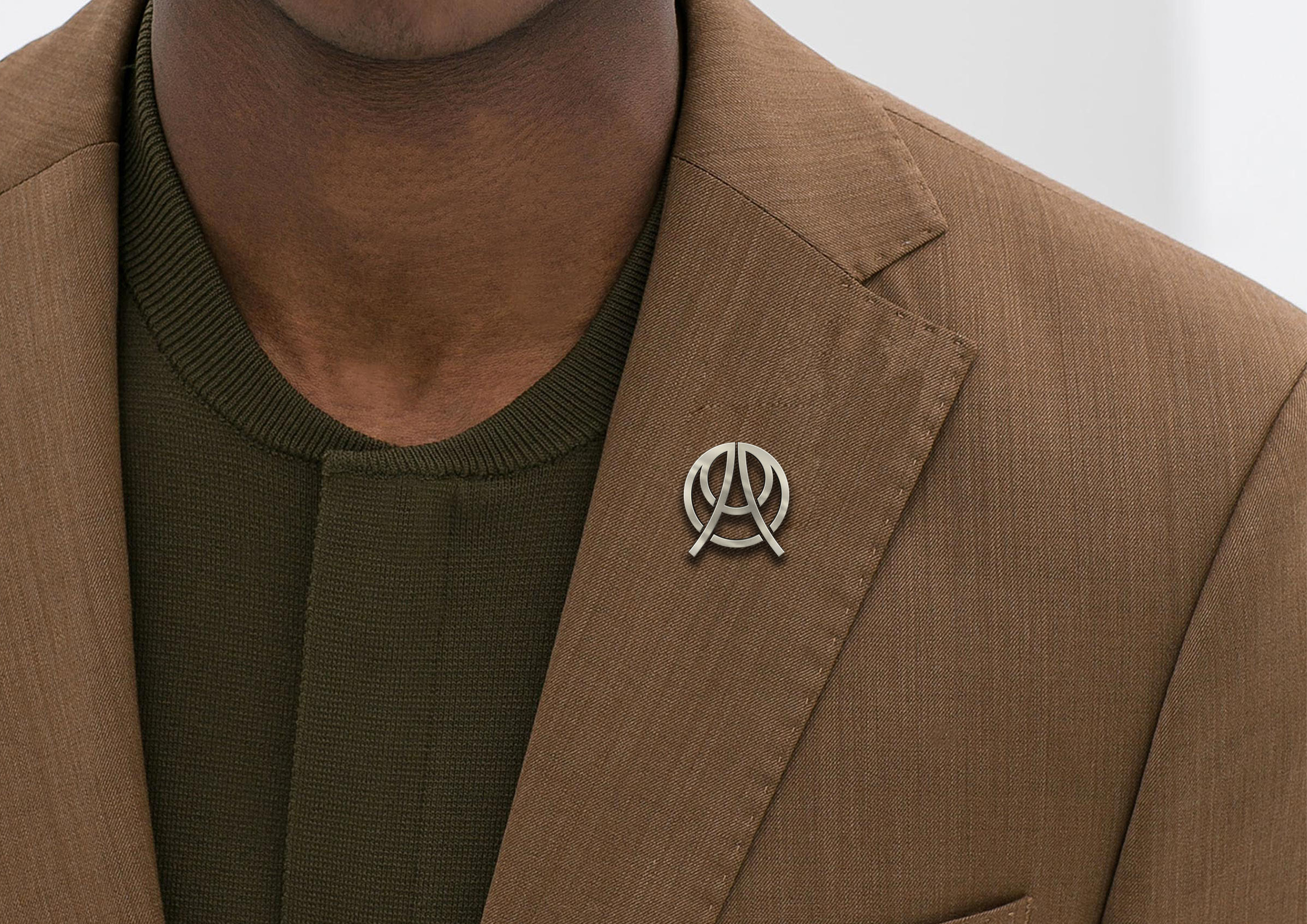
Logomark
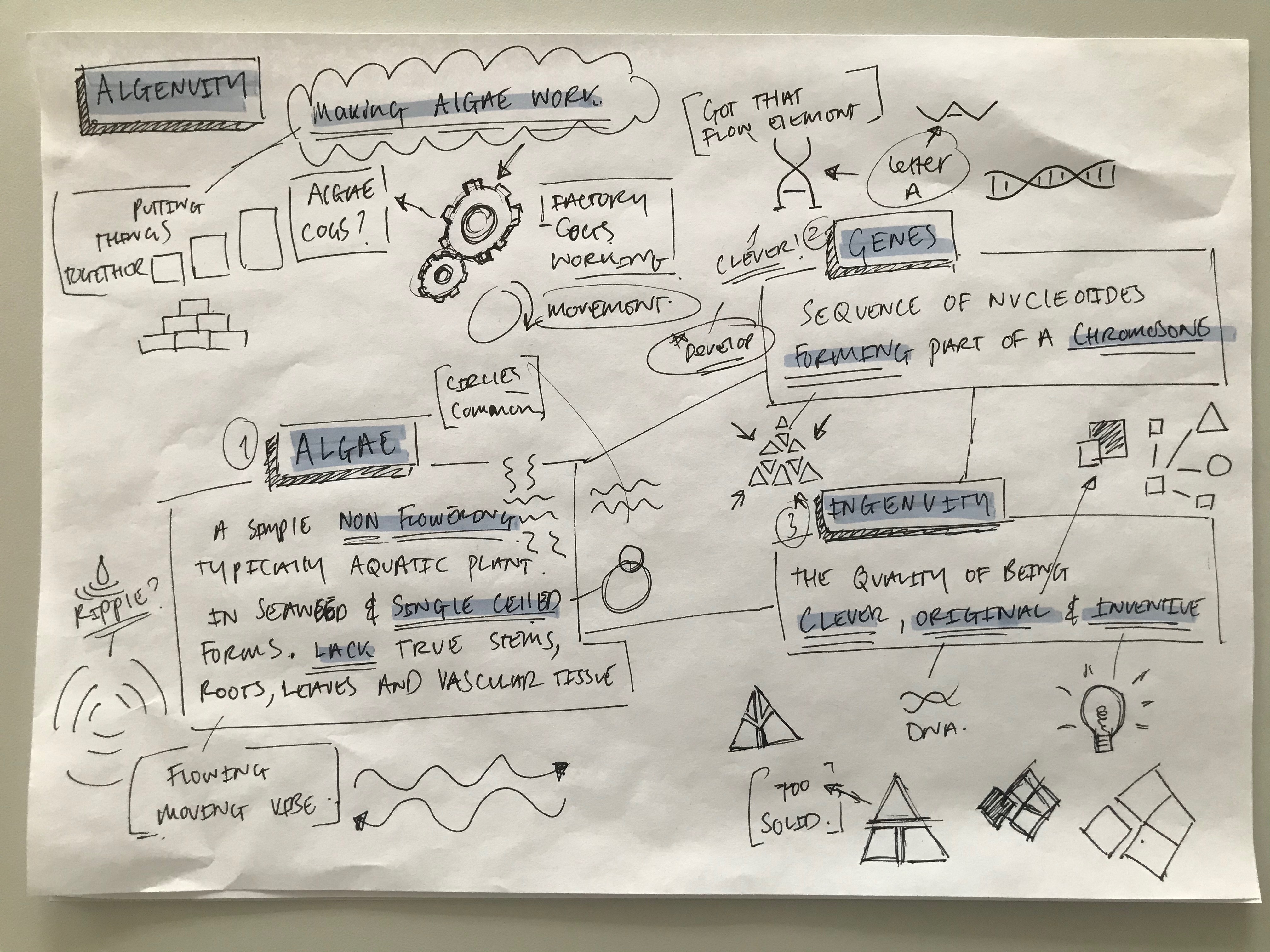
The name Algenuity is made up of three words; Algae, genes and ingenuity
This was a starting point for the logo design. During the research and ideation phase I discovered common visual elements found in these words; circles and fluid shapes. The circles captured the Algenuity vision, algal cells are circles and the globe is rounded, metaphorical representing an algal world.
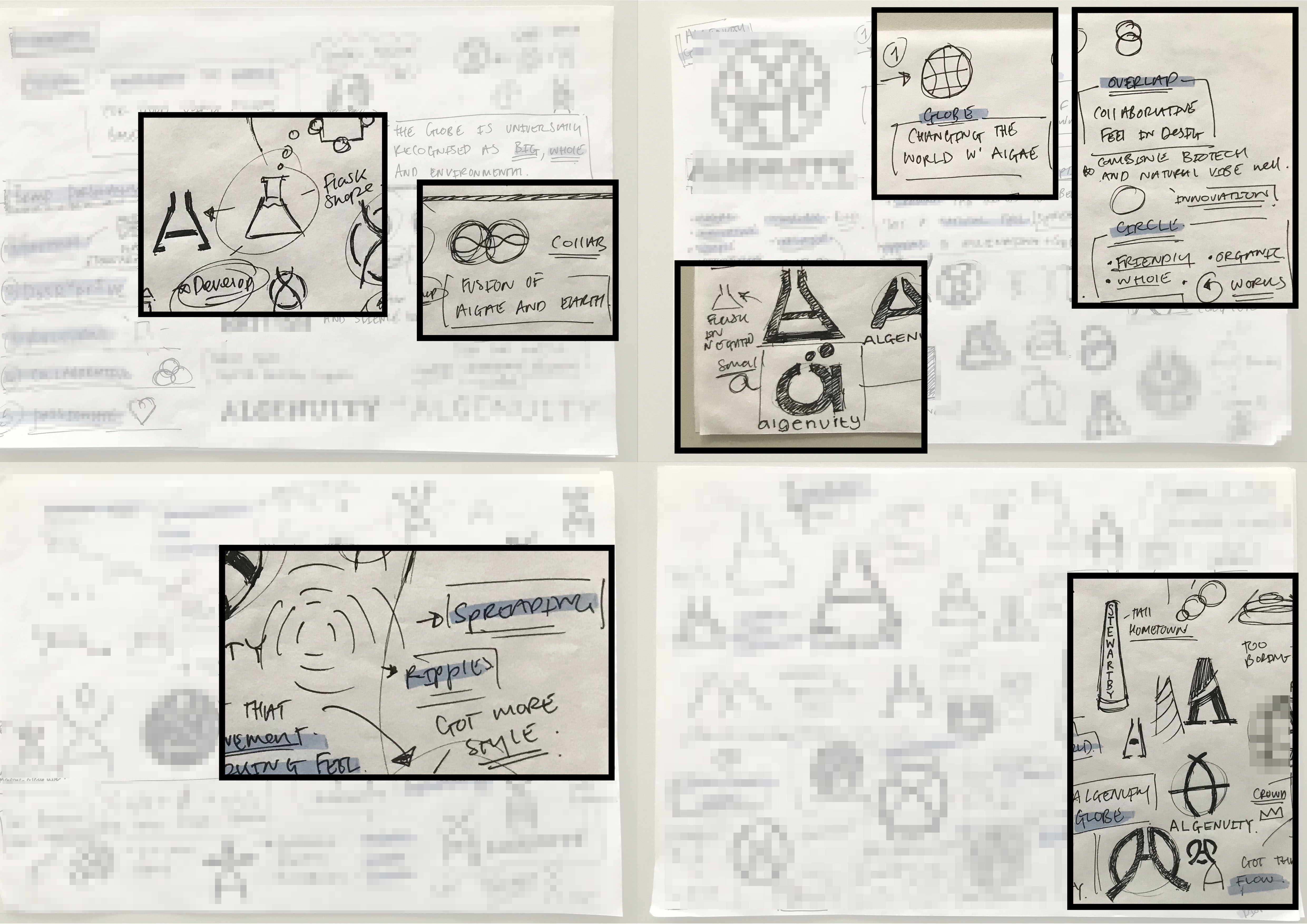
Algenuity was founded in Stewartby, a model village which was originally built for the workers of the London brick company. I felt this connection was both unique and deep rooted within the company heritage and was worth exploring, bringing elements of the chimney landmark into the design to create the letter ‘A’.
I combined the circle and chimney idea and stylised the ‘A’ extending the stems to break out of the circle to represent growth and disruption.
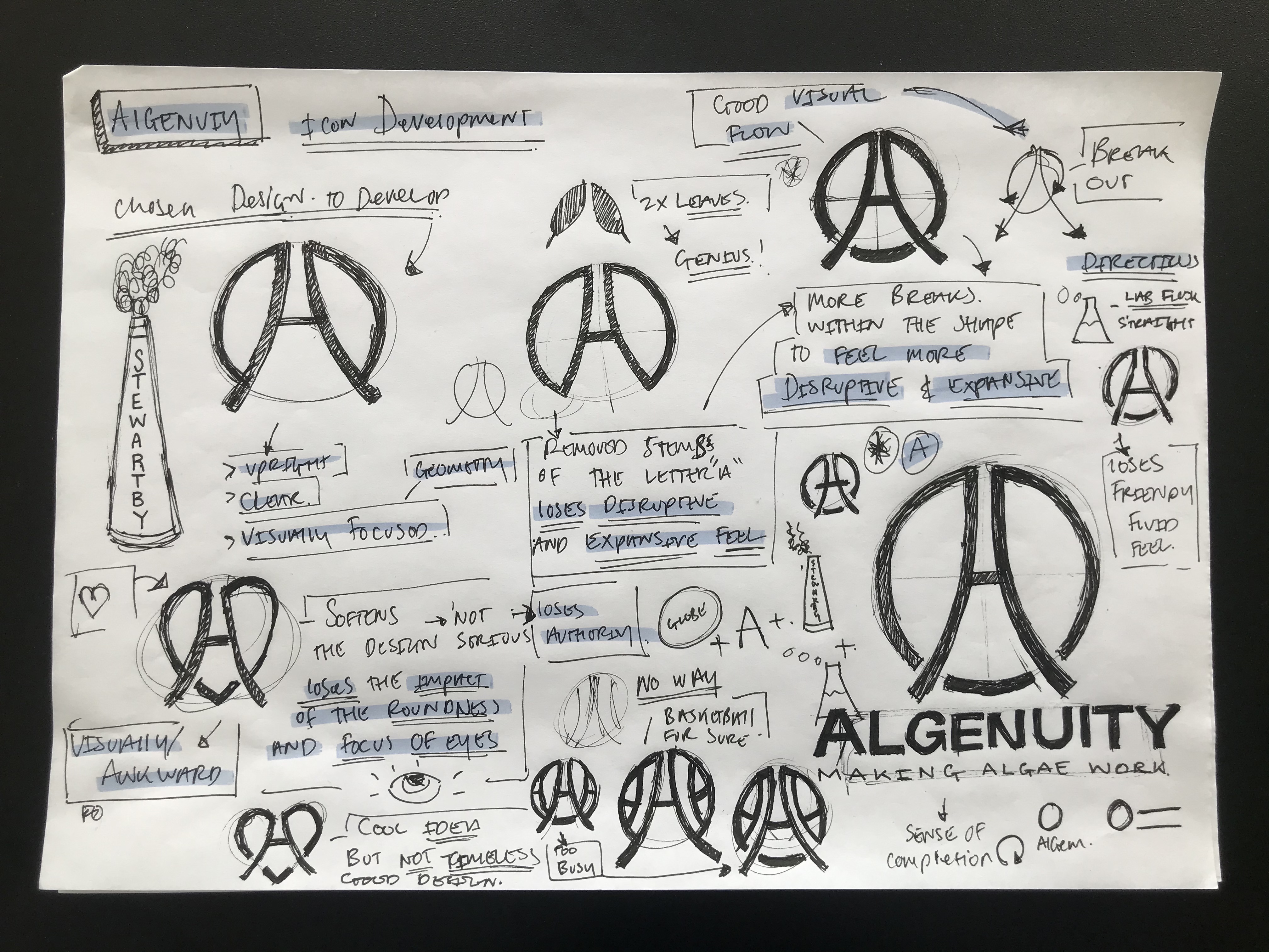
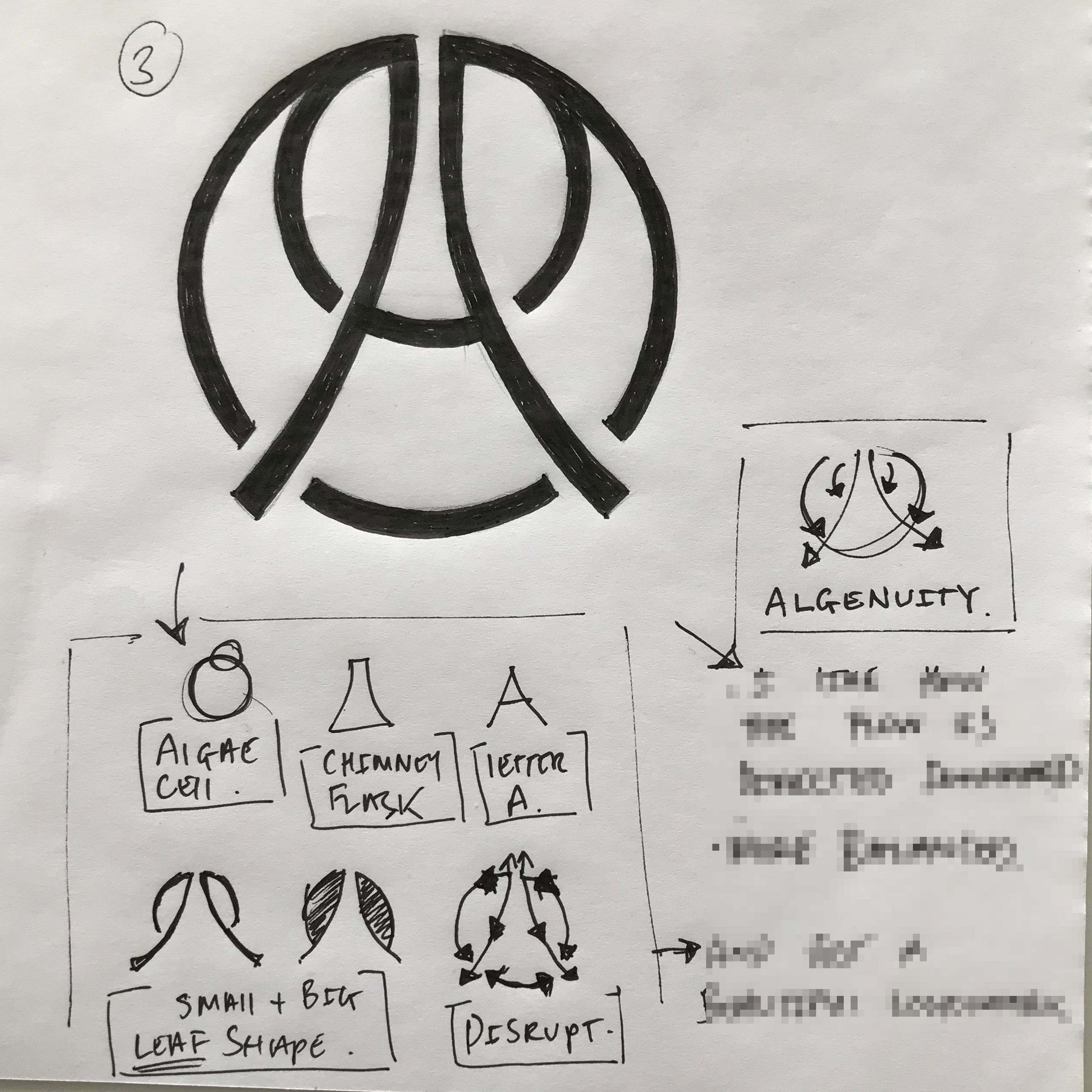
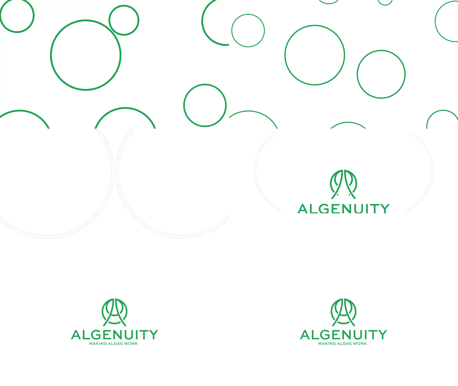
After weeks of refinement and revisiting my initial ideas I added a second circle into the design inspired by the algal cells which significantly enhanced the design whilst retaining its simplicity. The final logomark is made up of four overlapping circles creating a simple and memorable mark.
Communication
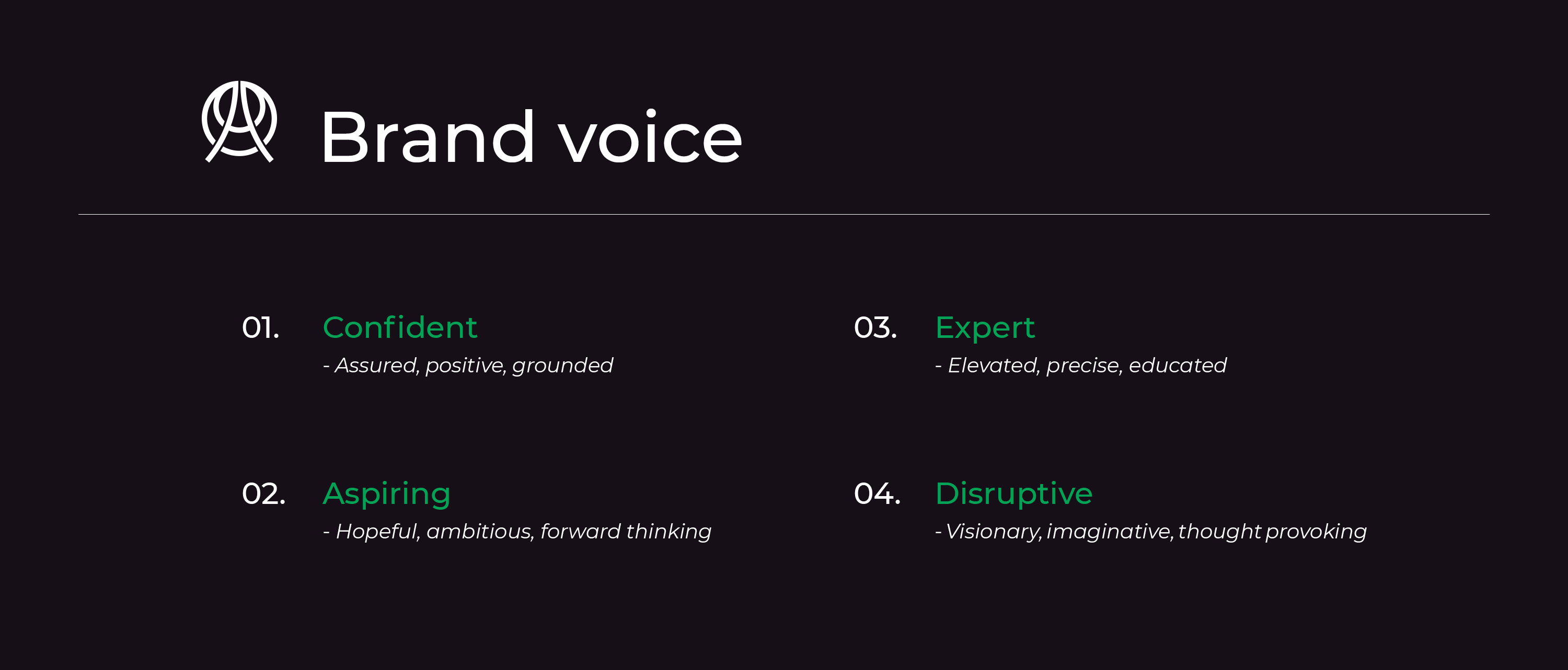
Verbal expression is an integral part of a brand experience. Spending time with the team and communicating directly with the leadership board I was able to develop a set of brand voice and tone guidelines.
The Algenuity brand voice is confident, expert, aspiring and disruptive.
Visual language
To develop a holistic brand system, I constantly referenced Algenuity’s brand attributes, cutting edge, disruptive and professional.
Typography: Sweet Sans was chosen for the word mark both for its legibility modern look and visual compatibility with the logomark. Montserrat is used for all brand communications due to its balance and accessibility.
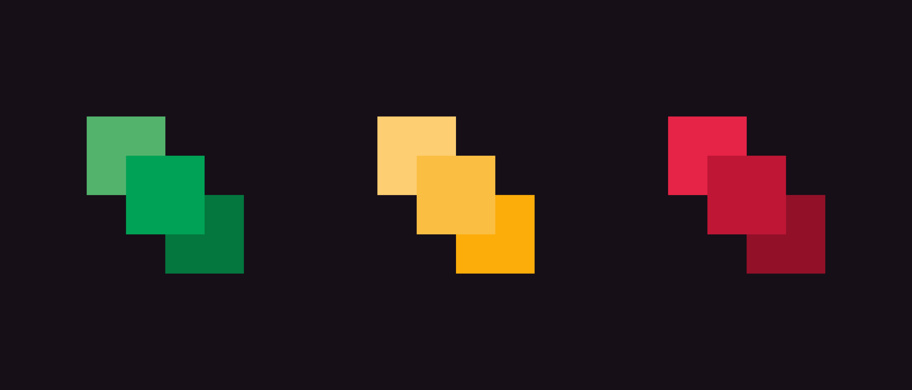
Colour: The Algenuity brand system is primarily black, white and green with a secondary palette of vibrant colours taken from Algenuity’s Chlorella Colour samples. These colours provide contrast and accents to UI elements and data visuals.
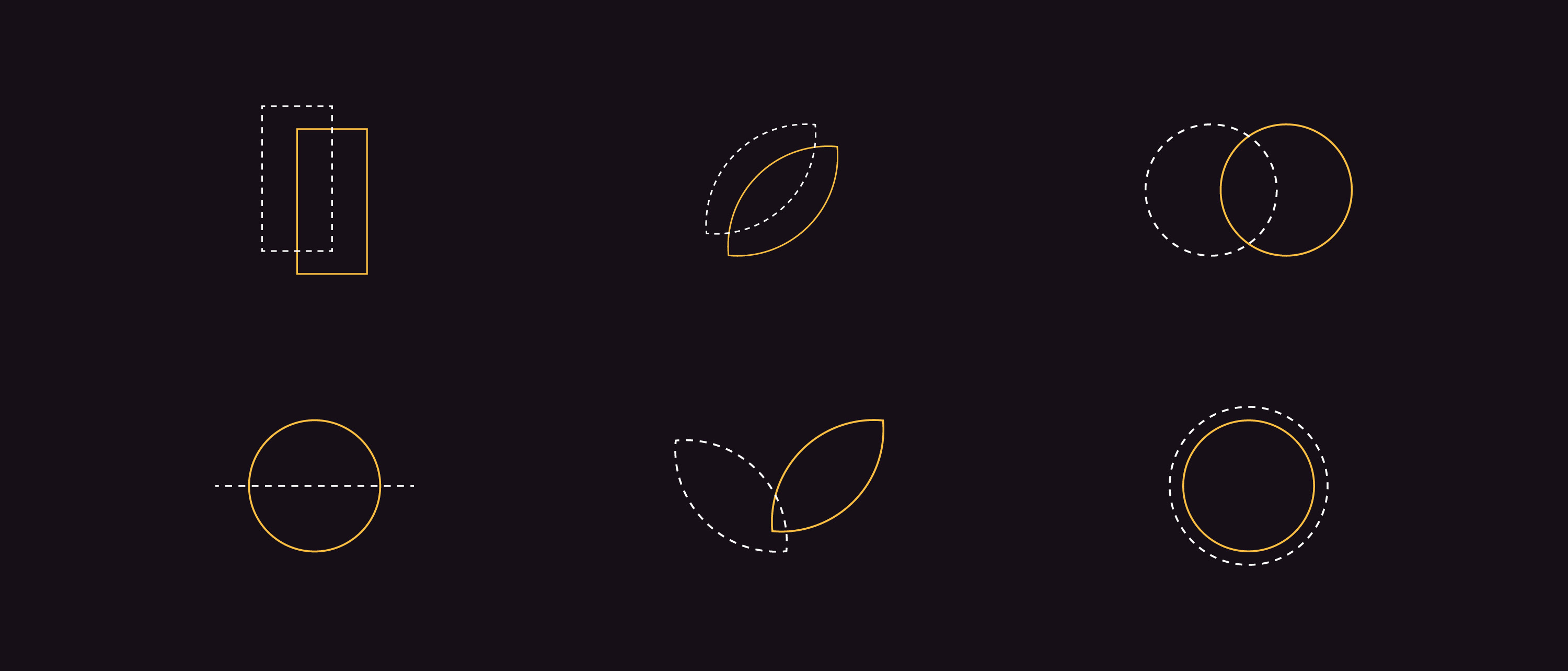
Iconography and patterns: A set of icons were developed for chlorella colours, consisting of 1px stroke dotted and solid lines overlapped for a disruptive feel whilst providing a strong framework for growth. Three custom circle patterns were created to continue the fluid algal feel throughout the brand.

Interactive
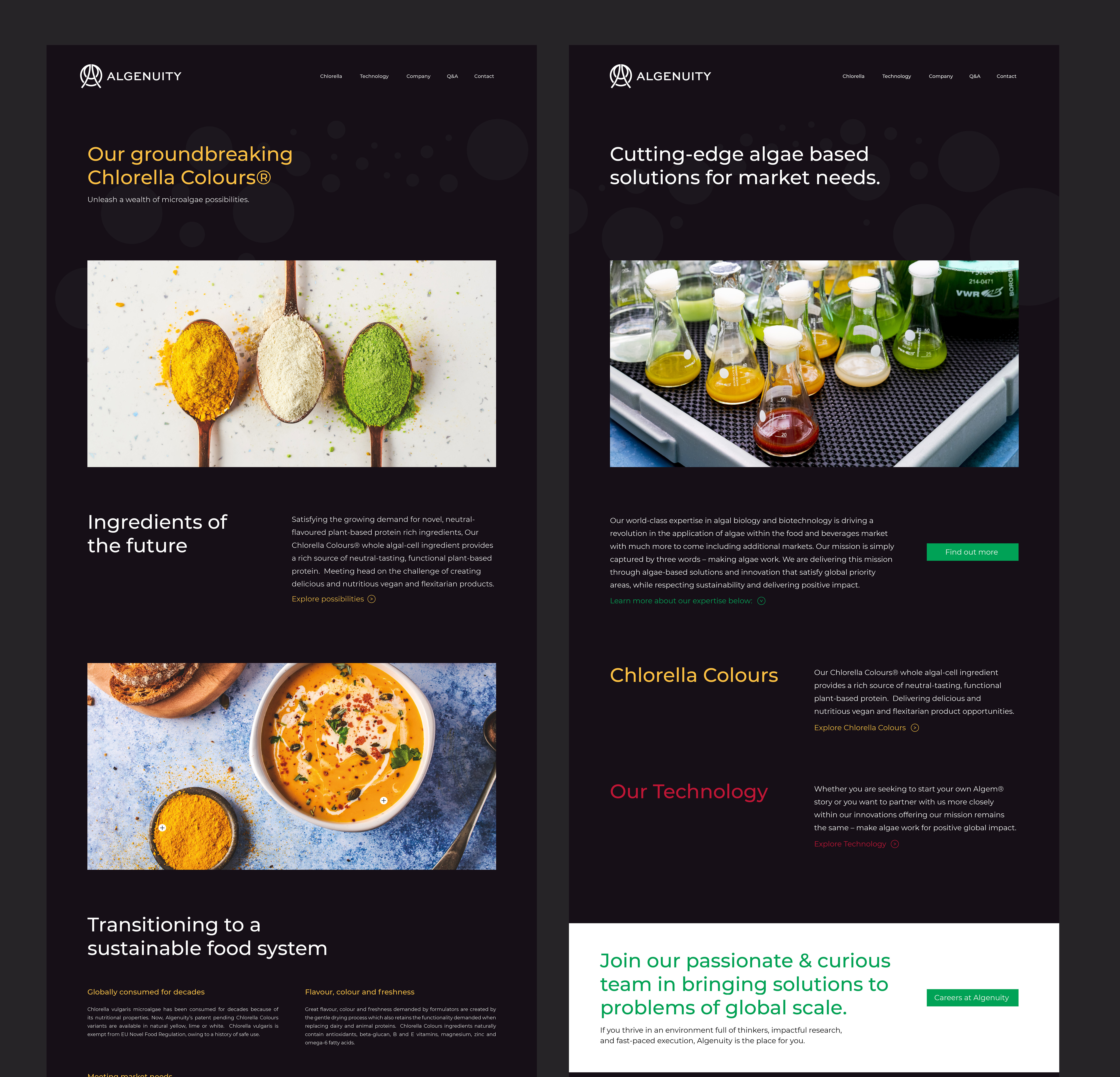
Algenuity’s website needed a refresh that would translate their expertise and cutting edge approach to their global corporative clients and science audience.
I worked collaboratively with the Algenuity team on creating content and copy for the website then developed sitemaps and wireframes, which we refined before starting the design and launching.
The overall layout follows a simple hierarchy enabling the user to navigate easily. The icons help to translate information and the use of the secondary colour palette helps to grab attention and sub-brand different aspects of the company.
