âmesœur - Bistro
Amesoeur is a continental bistro based in Cardiff, South Wales. Serving classic dishes with a modern twist.
This project required a different mode of thinking as I was working with an empty space, I had to communicate thoroughly with the client to understand her vision. Asking the right questions and getting detailed answers was the key to creating the amesoeur brand.
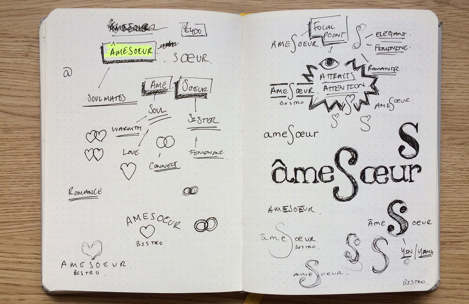
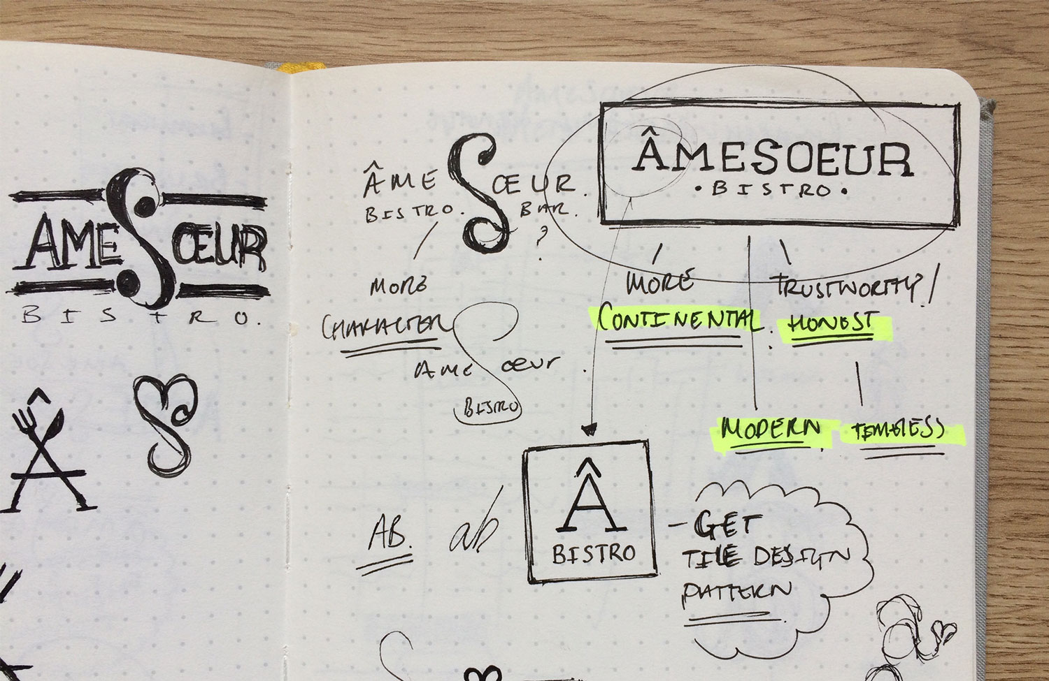
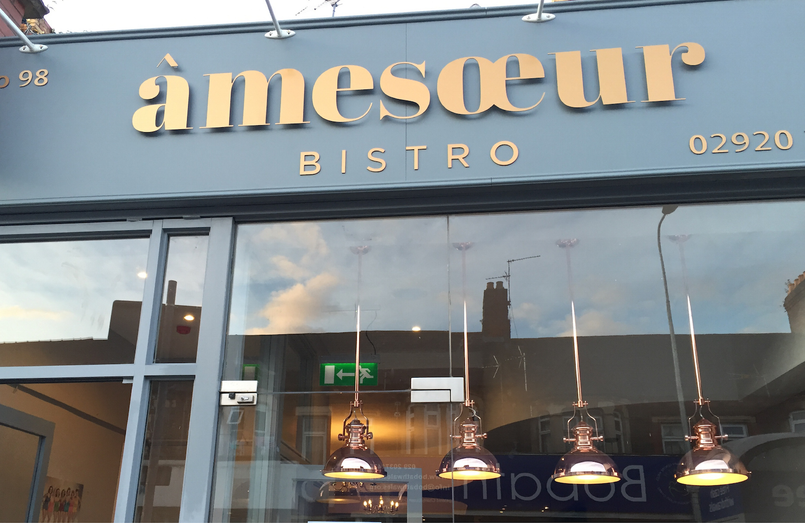
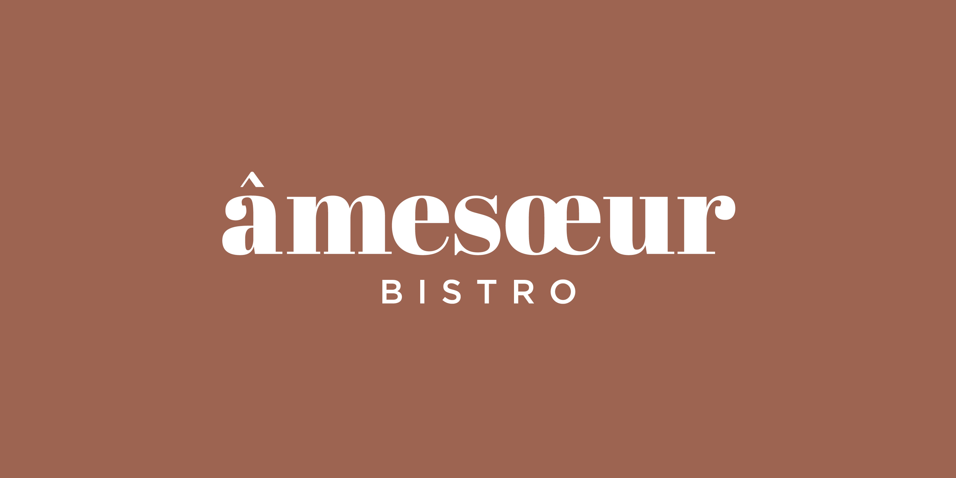
The French name itself is very unique and by adding further detail it could distract or confuse people from interpreting the name, so I focused on making a typographic logotype. The word ‘amesoeur' means ‘soulmates’ so I instantly began exploring the idea of connection and experimenting with elegant shapes and graceful typefaces.
Finding the right typeface that exudes both a modern and continental feel was essential to the amesoeur identity, the elegant curves and flat/delecate serifs (strokes) within the chosen typeface gives off a sense of sophistication without being too pretentious, Inviting people in and attracting attention. The ligature of the œ within the name also symbolises the idea of connection without doing too much.
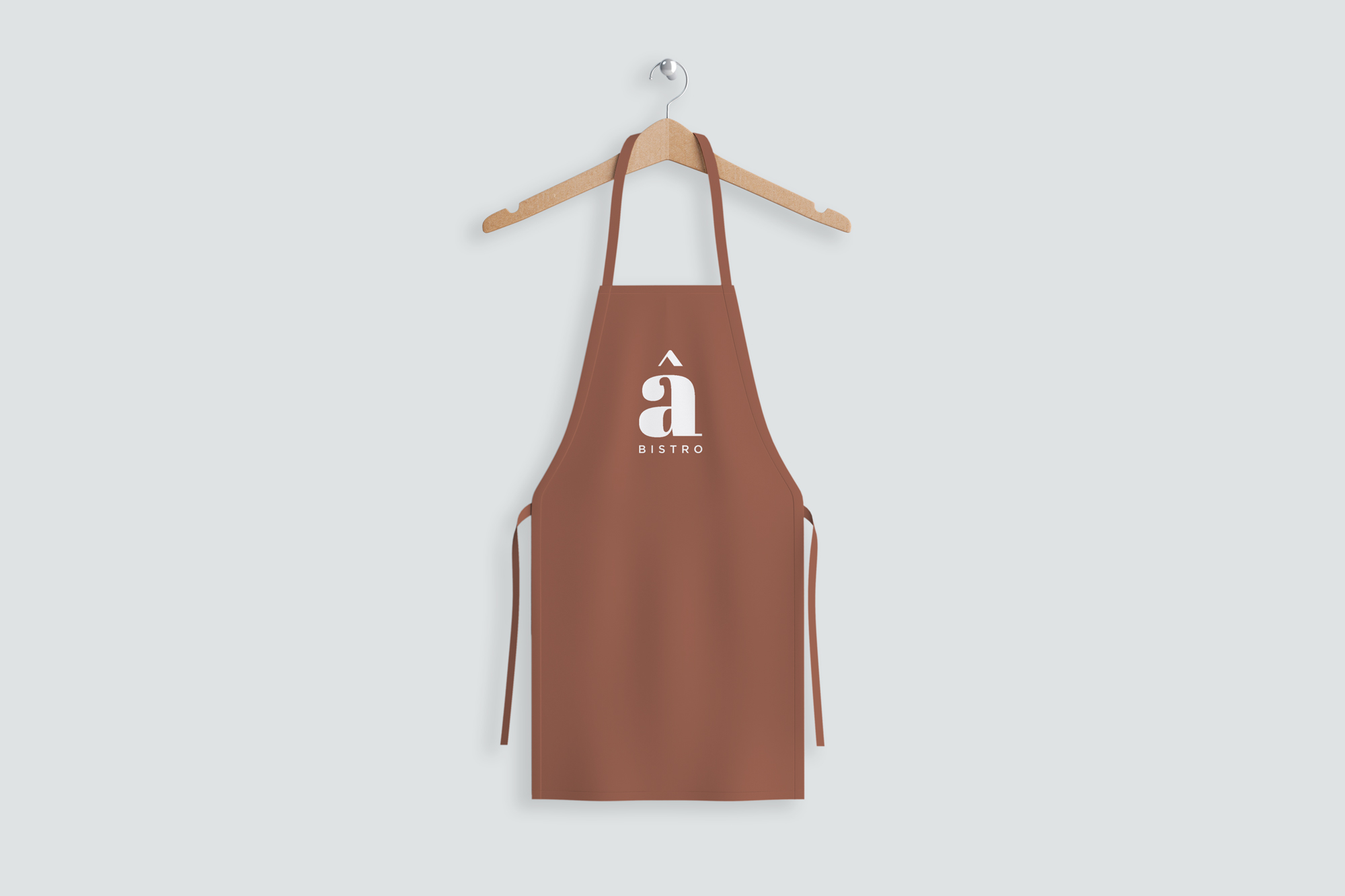
During the design process I decided to use a lowercase ‘a’ for the logo, It is more friendly, inviting and balances out the overall design, creating an aesthetically nuanced visual. The ‘a’ is the main focus of the logo as it holds the circumflex above it, this detail is unique to the name and I felt it should be exposed and used as part of the identity, thus creating the separate ‘a’ Icon.
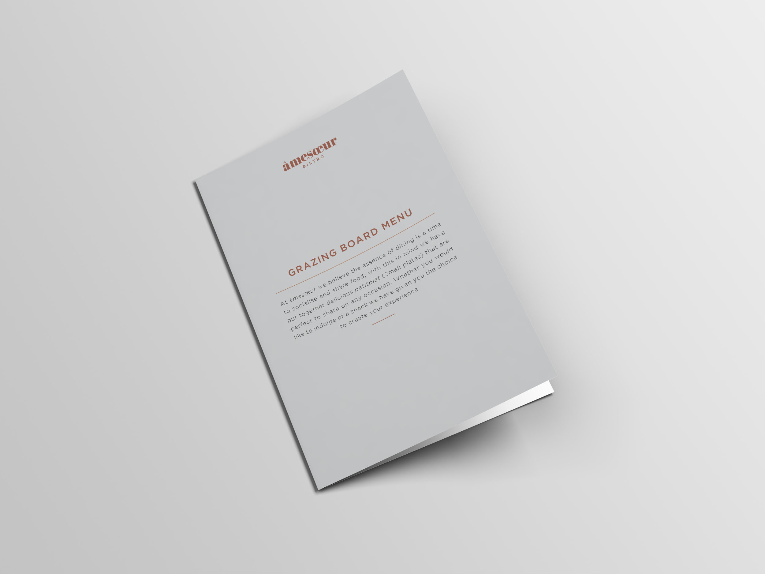
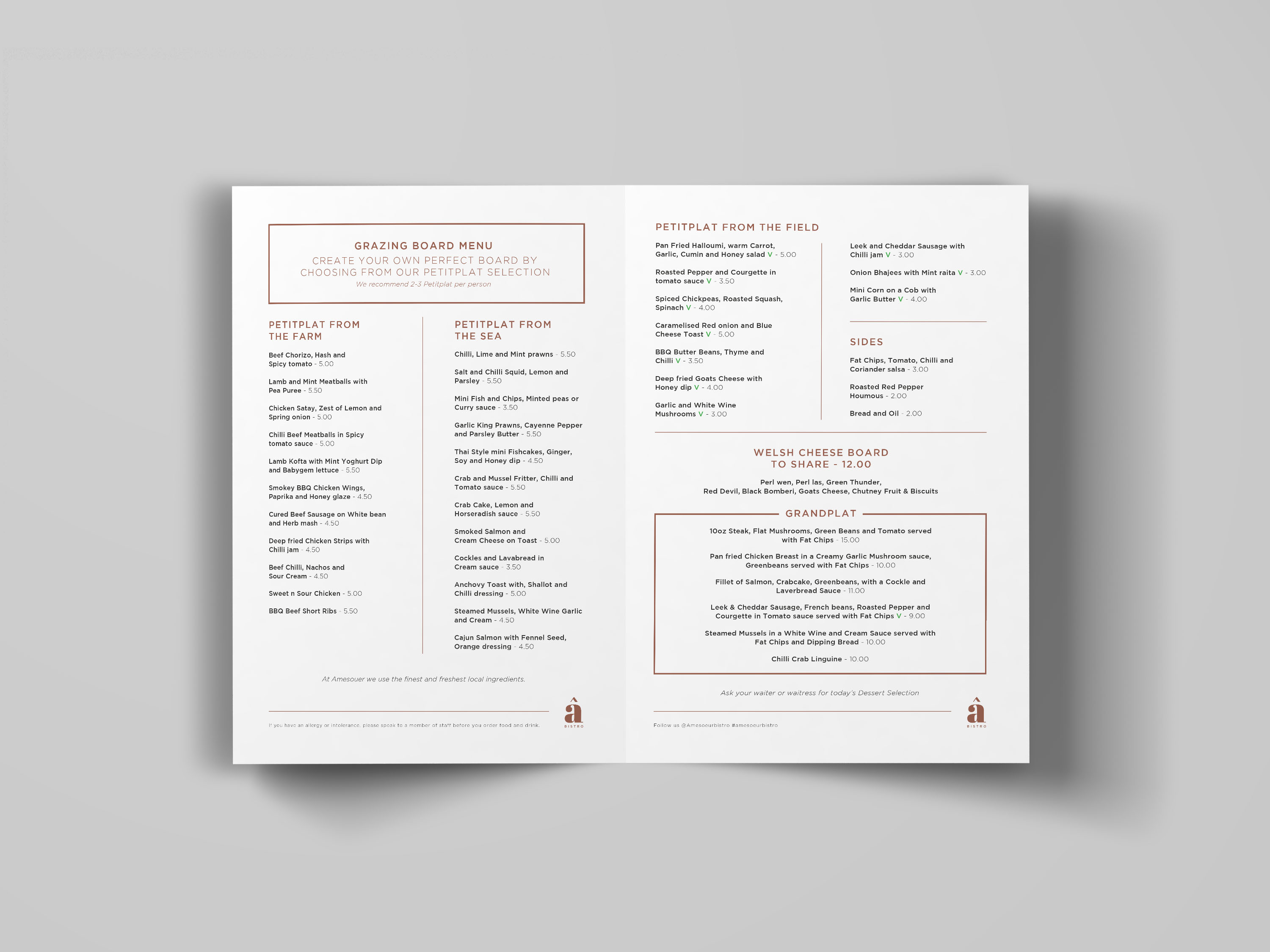
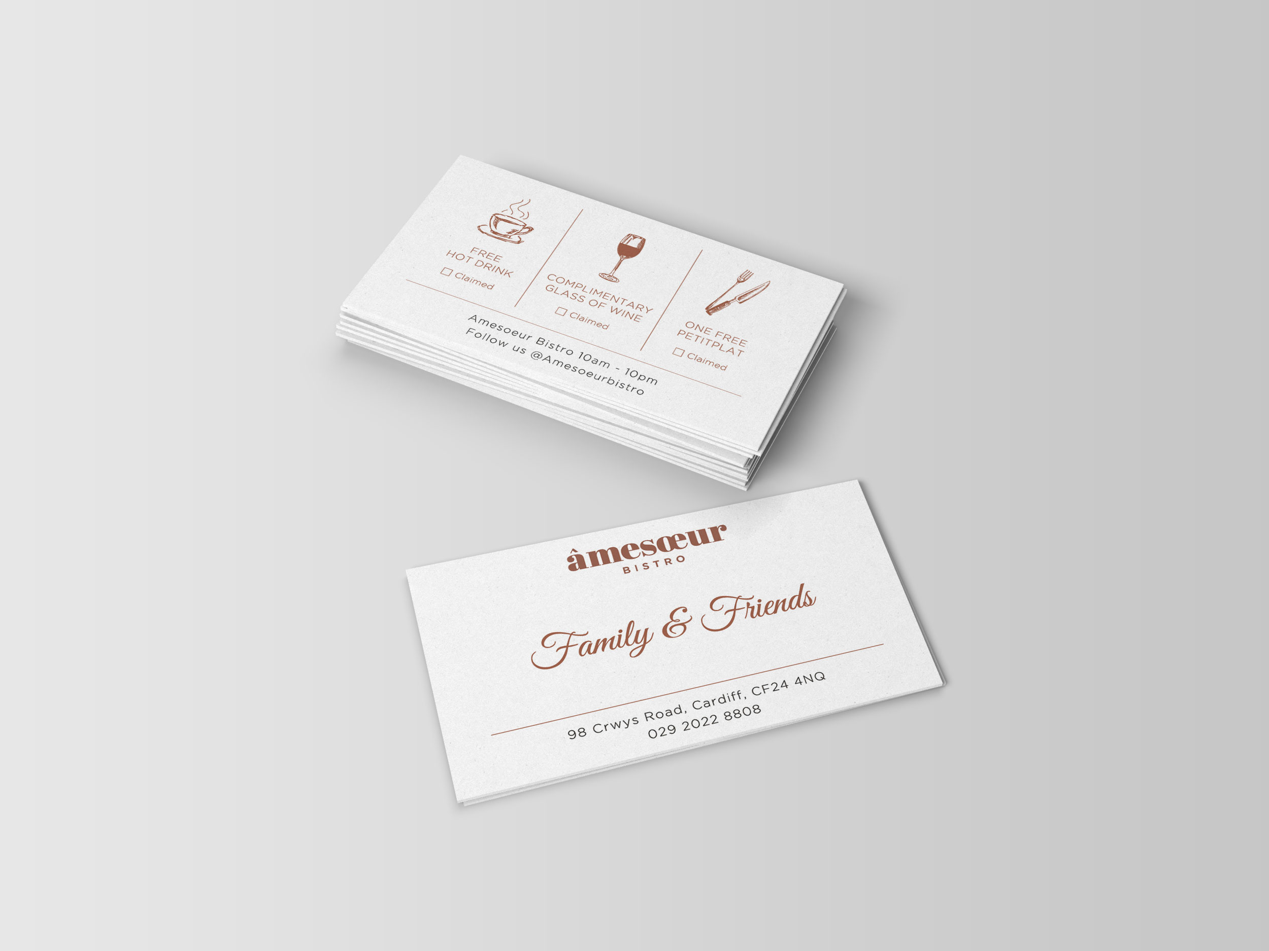
The highlight of the bistro was the bar, which is decorated with geometric patterned tiles; By infusing this simple pattern into the brand identity, I was able to create a pleasant but subtle continuity between identity and interior design extending across business cards, menus and signage.
