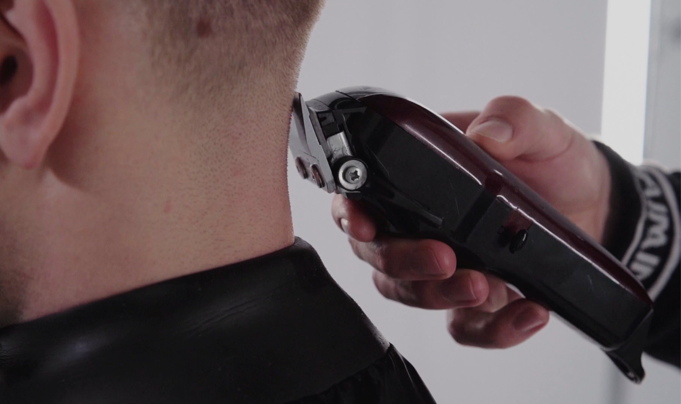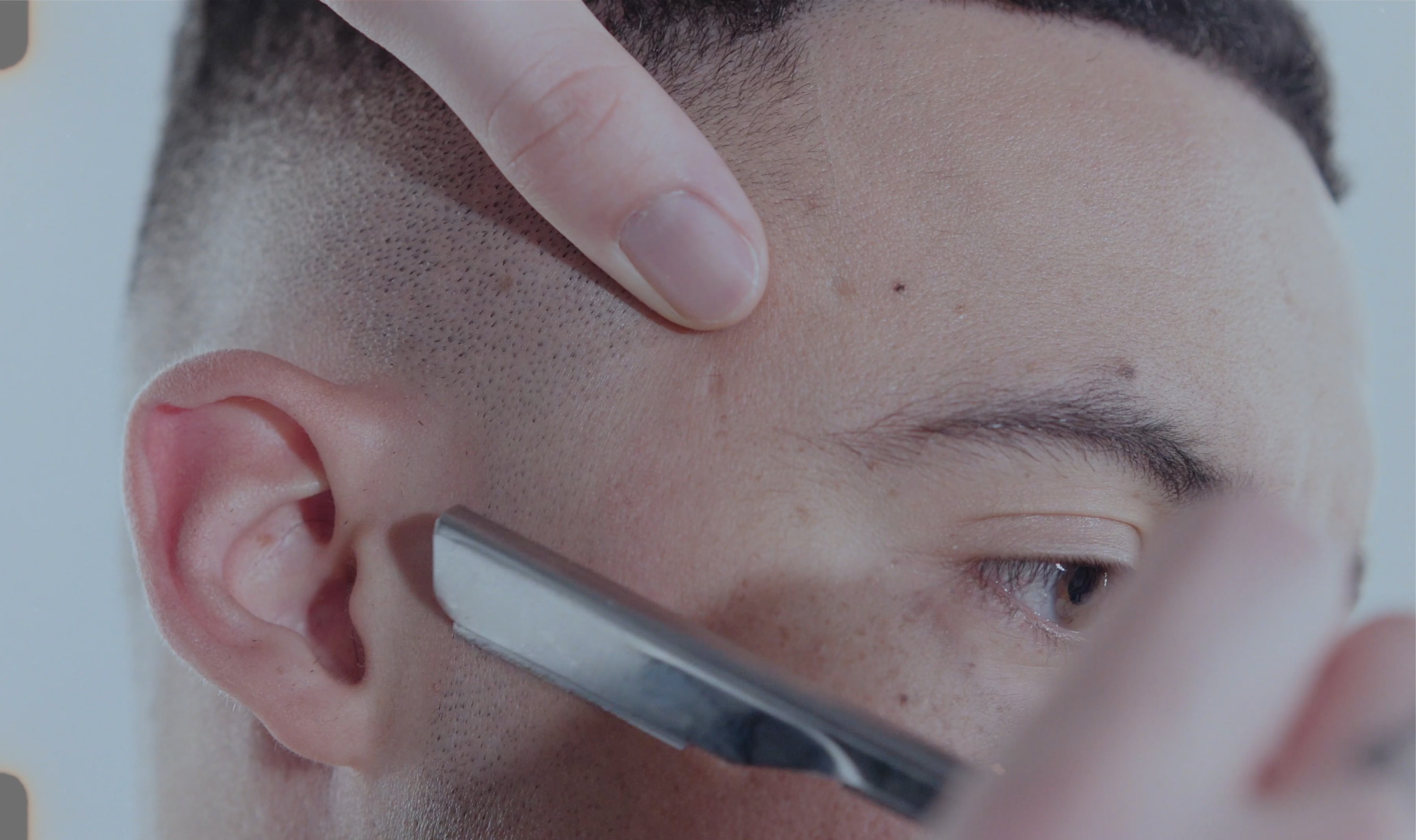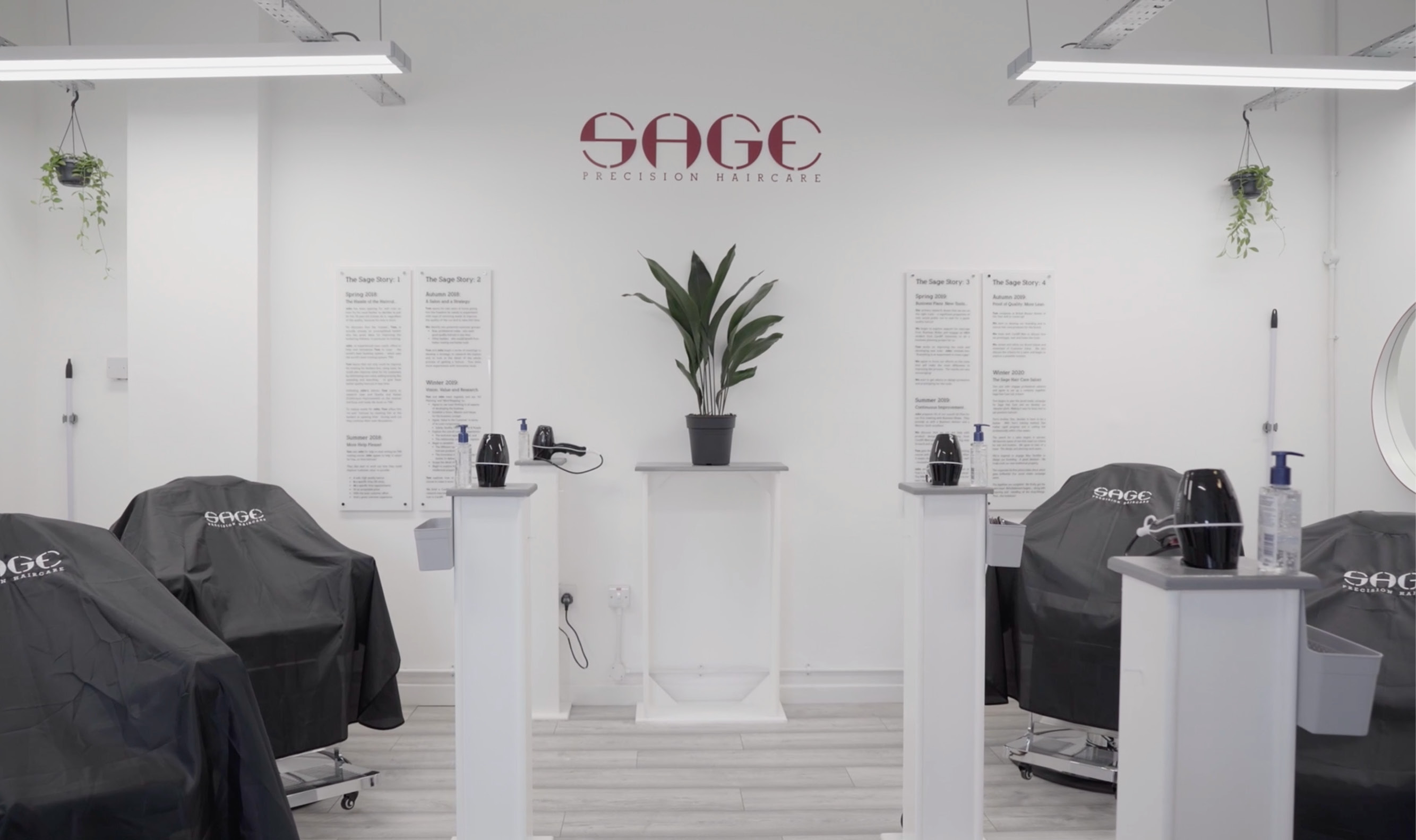
Sage is an innovative haircare brand based in Cardiff, Wales which benefits the customer & the forward-thinking individuals of the hair industry.
Applying the LEAN business model to the world of barbering Sage has set out to revolutionise the hair industry through their products, process and modern approach to barbering.
Founder and award winning barber Tom Sage reached out to me in late 2019 with his vision to change the hair industry, Sage needed a revolutionary logo to fulfil its mission.


Design process
The barbering industry is flooded with trendy visual identities and designs that follow a similar look, this gave me the perfect opportunity to introduce a clean, fresh and modern look to the industry through the Sage brand.
Everything about Sage is precision; precision timing, precision cuts and precise methods, so it was clear to me the logo should speak exactly that.
During the design process I noticed circles were a common element, peoples heads are circular, a circle represents completion and what really stood out was the circular target icon; the target icon was a clear representation of accuracy and precision.
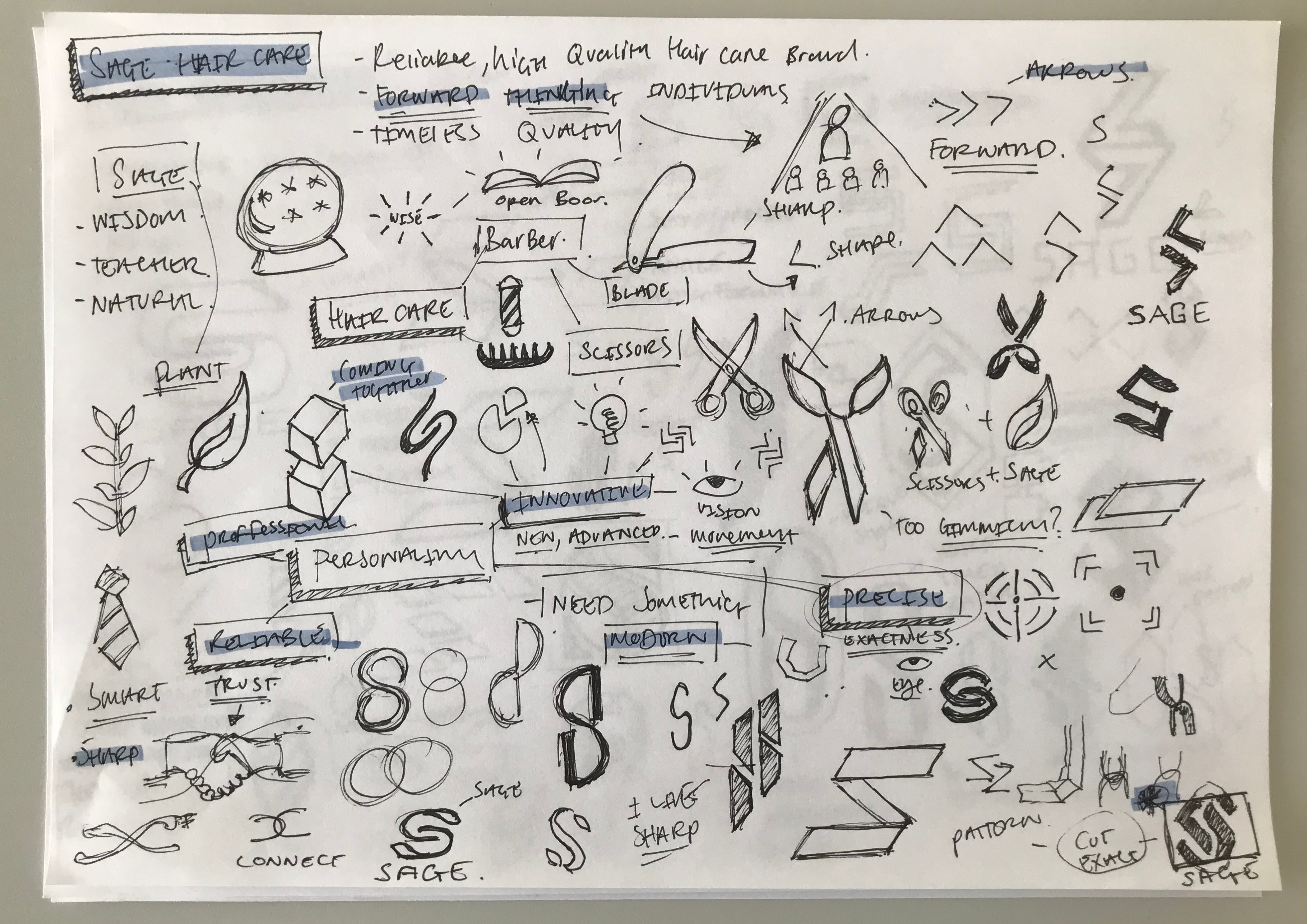
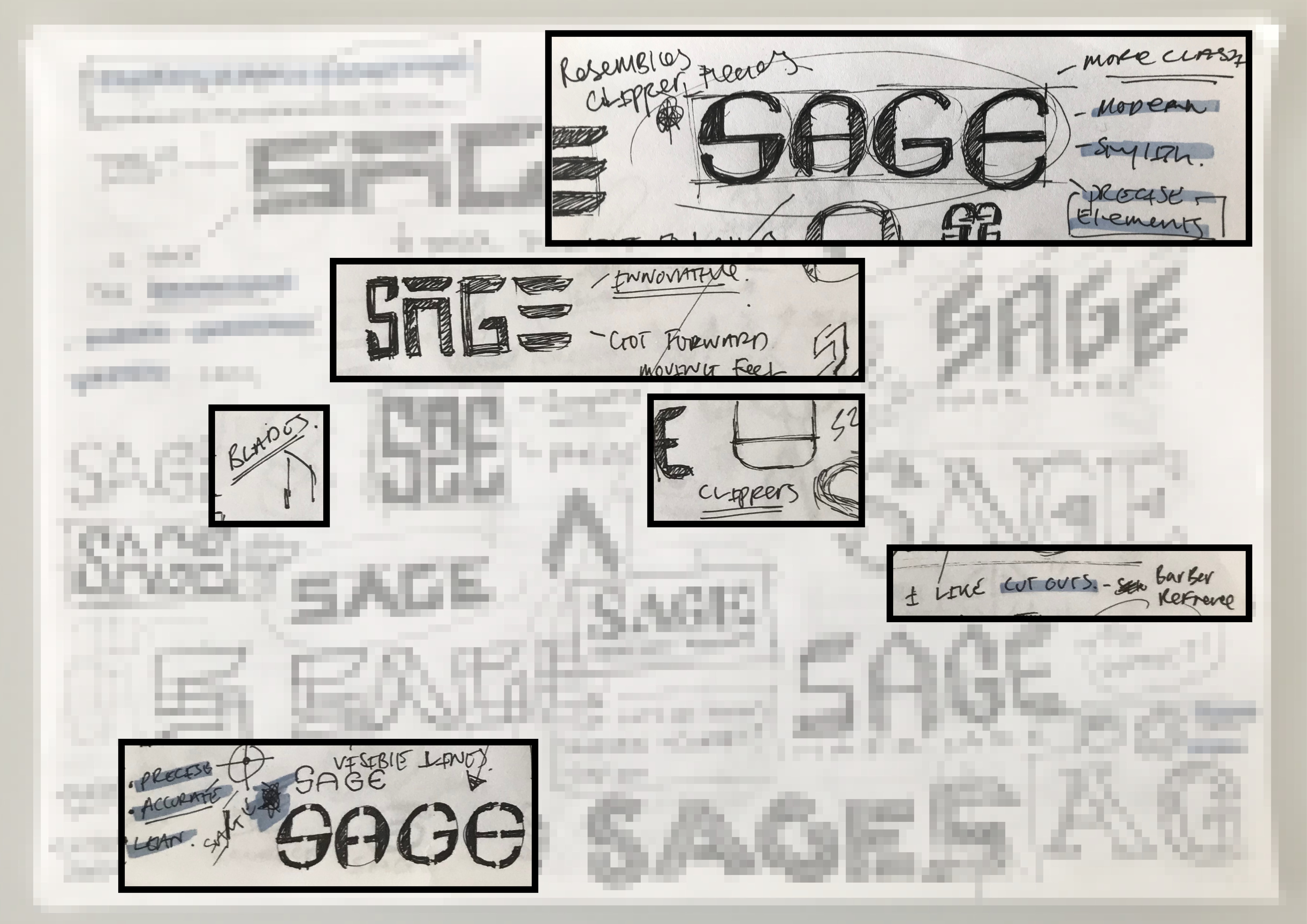
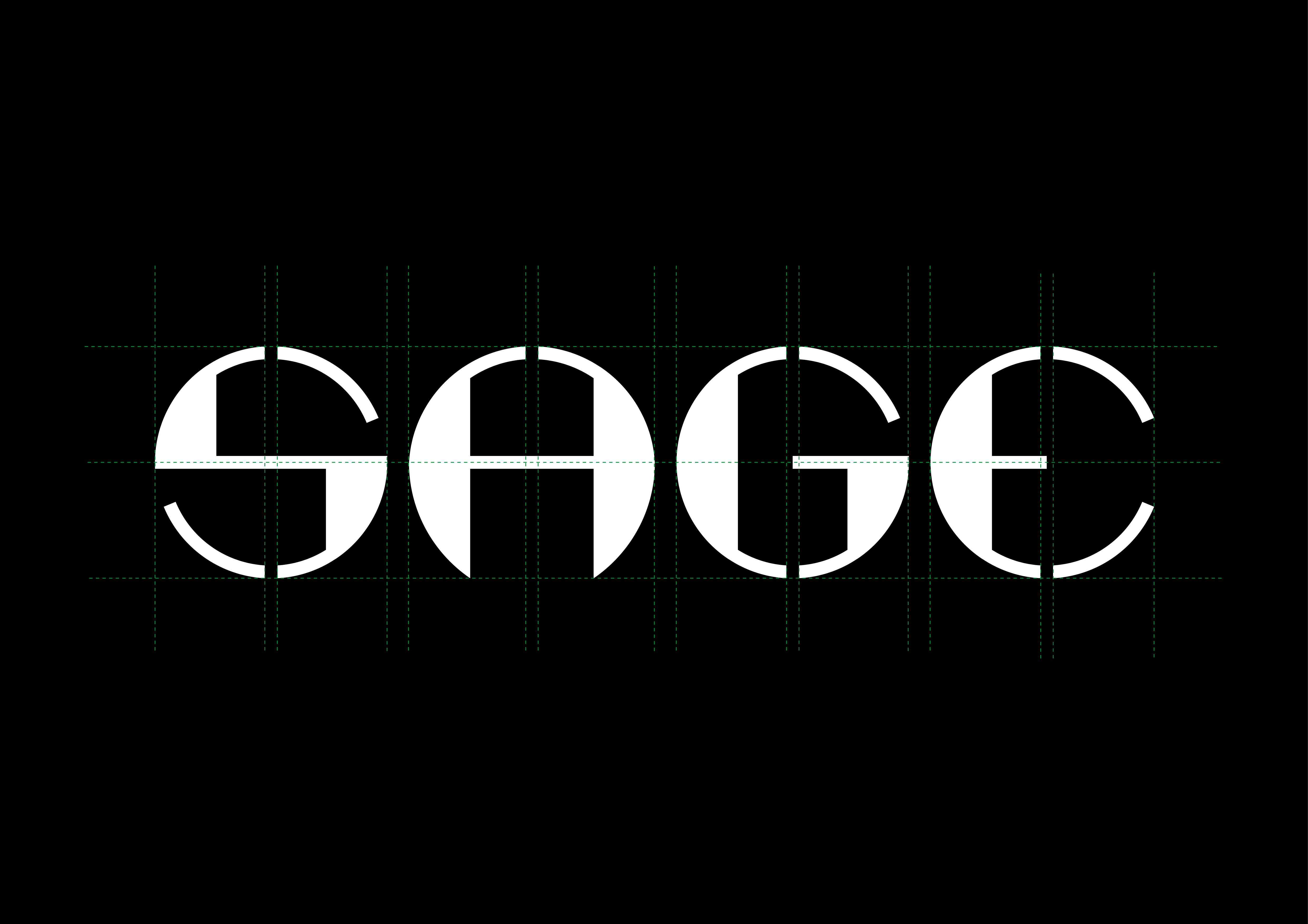
considering all these elements I created a custom logotype, the four circles worked well due to the number of letters in Sage. The structure of the letters follow a simple grid capturing both the precise geometric feel as well as the forward thinking vision of Sage.
